and easily accessible. For a normal person on a screen reader, skipping over an image’s context or unclear link or a mislabeled text may not feel like that much of a big deal. But, for someone relying on accessible content, it can be the difference between understanding and confusion.
Most of these issues are easy to catch and fix if you know what to look for.

Common Accessibility Errors
While these appear rudimentary by nature, these mistakes happen more often than you would think.
Alt text is meant to describe an image, but sometimes it is incomplete, ineffective, or simply not there. Calling out a “photo” or a “chart” does not really help. For a line graph with data for exports and imports over a period of time, say, from 2013 to 2023, the alt text should indicate what is represented on each axis, the range of values and increments on each axis, how many lines are used, how do the lines look, the key data points, and the trend depicted. As the user reads it, an image should be formed in their eyes.
2. Unordered Headings
Headings are not just for style. They help users and screen readers to easily go through your content. If headings jump from “Heading 1” to “Heading 3” without a “Heading 2” in between, it disrupts the flow. Headings are like signposts on a highway. Make sure they don’t end up somewhere else.
3. Generic Link Text
“Click here” or “Read more” does not explain what the link is about. If you want the reader to follow a particular link, clear, specific link text, such as “Download the accessibility checklist,” is far better.
4. Poor Contrast or Over-Styled Fonts
Fancy fonts and hard-to-read color combinations can make content inaccessible for many readers. Keep it simple and ensure enough contrast. No gray on white.
5. Tables Without Clear Labels
Tables need proper headings for rows and columns. Without them, they appear like just blocks of confusing data for screen reader users.

Example: Accessibility Errors in High School Content
Let’s say you’ve created an educational resource for Grade 9. The resource includes a chart showing students’ progress in various subjects. The alt text for this chart is simply “Chart.” While this may seem like an innocent oversight, it creates a problem for students with visual impairments who rely on screen readers. Without detailed alt text, these students have no clue what the chart is about or what it is conveying.
Implications: In a K-12 setting, every student must be able to engage with the content equally. If a visually impaired student cannot access vital information like test results or grade progress, they fall behind. This could impact their learning experience and academic performance. It also leaves the educational institution vulnerable to legal challenges related to non-compliance with accessibility standards.
When accessibility is overlooked in these contexts, it creates educational disparities and is a missed opportunity for inclusive learning environments.
How to Spot These Errors in Your Workflow
Some of these tips would be beneficial to make your editorial workflow accessibility-friendly.
1. Start with a Checklist
Use an accessibility checklist to review key areas like alt text, headings, and links. Having a clear guide makes it easier to stay consistent.
2. Use Accessibility Tools
Platforms like Wave and Axe can scan your content for errors. Think of these as your accessibility proofreaders.
3. Test with a Screen Reader
Listen to your content using a screen reader. If something feels awkward or unclear, edit.
4. Peer Reviews
A fresh set of eyes can catch things you might miss. This is also a great way to get your team thinking more about accessibility.
Tools to Simplify the Process
You do not need to catch everything on your own. These tools can help:
• Accessibility Checkers: Most editing tools, like Word or Google Docs, have built-in checkers.
• Specialized Tools: Platforms like Wave or Axe highlight errors and offer fixes.
• Contrast Checker: Use a tool like WebAIM’s Contrast Checker to make sure text is readable against its background.
• Screen Readers: Try reading your content with a screen reader to experience it from the user’s perspective.
Editors Have a Responsibility
Educational content should be equitable, accessible, and enjoyable by everyone. As custodians of content, it is the responsibility of us, editors, to ensure it is done right. It is not extra work but a thoughtful gesture that ensures your content reaches everyone it is meant to help.
EduQual Stands for Equitable Content
We prioritize:
• Inclusive Language: Use of gender-neutral pronouns and balance identity-first vs. person-first language to ensure that learners feel seen and respected in every content item.
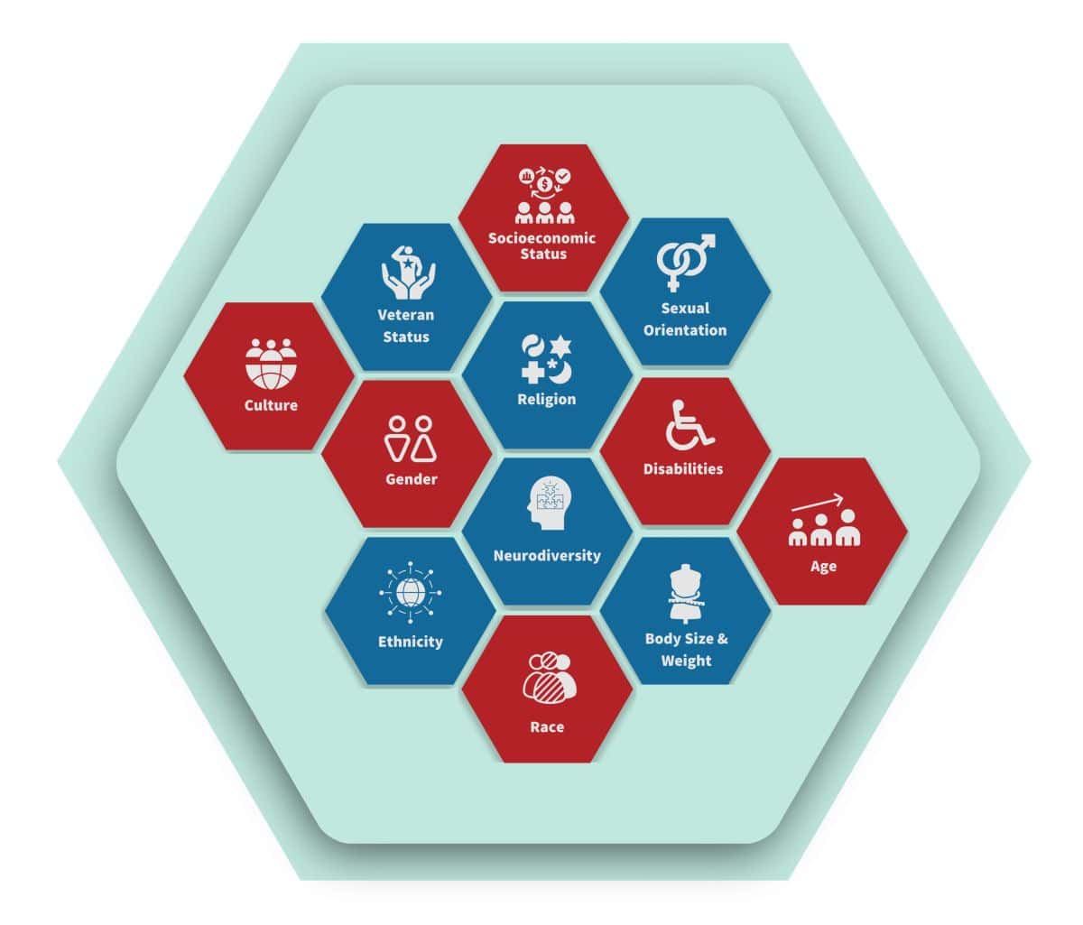
• Cultural Sensitivity: Actively avoiding stereotypes and essentialism, ensuring representation across racial, ethnic, and socioeconomic groups. For example, when localizing content for regional curricula, we include examples that resonate with learners from diverse backgrounds.

We also focus on building learner-centric content that avoids stigmatizing language around topics like weight, mental health, or socioeconomic status. For instance, we use inclusive examples relevant to various regions and identities while staying aligned with the client’s philosophy of quality, relevance, and inclusivity.
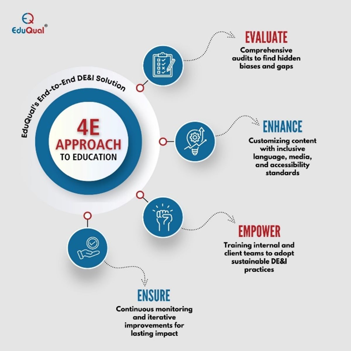
To support these efforts, we leverage advanced tools and frameworks for DEI compliance. This includes AI-powered bias detection tools for content audits and custom artifacts like checklists, training materials, and compliance dashboards for our clients.

